In this post, we will explore CSS variables and the prefers-color-scheme media query, and we will build a small example of how to implement dark-mode in a website without using any external libraries and with little to no use of JavaScript.
Overview
In recent years, “dark mode” has become widely popular. Ever since the beginning of the Internet, web developers have looked for ways to customize their users' experiences with different color palettes; most of the time leading to custom solutions that relied heavily on JavaScript and working around CSS’s rules.
Modern CSS, however, now includes features that allow developers to override easily override styles across a website or web application.
CSS Variables
With many years in the making, browser support for CSS variables expanded around 2016. Now, newer versions of most modern browsers support them.
It’s important to notice that these variables are supported by vanilla CSS; there is no need to use a pre-processor like Sass or Less.
As their name indicates, CSS variables allow us to store values once and use them across our stylesheet.
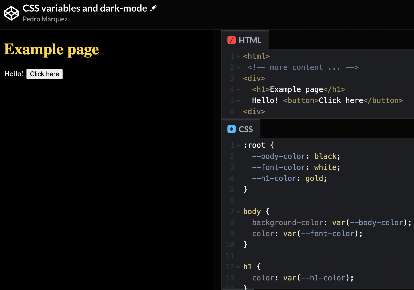
The following example creates two variables in a body block and one in a h1: body-color,
font-color and h1-color.
body {
  --body-color: black;
  --font-color: white;
  background-color: var(--body-color);
  color: var(--font-color);
}

h1 {
  --h1-color: gold;
  color: var(--h1-color);
}
Notice that variables are prefixed with --. That is how CSS recognizes that they are variables.
Then, within those same blocks, we apply CSS rules like background-color and color, and we get
the variables’ values by passing them to the function var().
While this example may seem over-simplistic, you can see the potential: We can take those variables and put them in a global scope:
:root {
  --body-color: black;
  --font-color: white;
  --h1-color: gold;
}

body {
  background-color: var(--body-color);
  color: var(--font-color);
}

h1 {
  color: var(--h1-color);
}
Notice that we moved the variable definitions to a block named :root. This pseudo-class matches the <html> tag.
This means that, from here, all CSS rules on the page will have access to these variables.

Some benefits
CSS variables allow us to centralize and standardize values for CSS rules across our web page. You can encapsulate specific values in reusable variables.
Most websites use a palette of 3 or 4 colors: primary, secondary, and accent colors. We can create a variable for each, and refer to those variables directly in every other CSS rule. If you want to change the palette, just change the variable definitions; no need to update each rule in every stylesheet.
Overriding CSS variables.
CSS variables follow the same rules as the rest of CSS; thus, variables can be overridden:
<h2>This is gold</h2>
<h2 class="page1">This is green</h2>
:root {
  --h1-color: gold;
}

h2.page1 {
  --h1-color: green;
}

h2 {
  color: var(--h1-color);
}
Since we can override CSS rules by adding specificity to the selector, we can also override the
variable definitions in :root:
:root {
  --body-color: white;
  --font-color: black;
  --h1-color: gold;
}

// we only override the variables we need:
[data-dark-mode] {
  --body-color: black;
  --font-color: white;
}
Now the :root block contains the variable definitions for “light-mode”, and the
block [data-dark-mode] overrides the body-color and font-color variables.
This means that, if the element <html> has the attribute data-dark-mode, the page
will have a black background and white font, instead of the default white background and black font:
<!-- Light mode: -->
<html>
  <!-- ... -->

  <!-- Dark mode: -->
  <html data-dark-mode></html>
</html>
The attribute data-dark-mode is no reserved word. This attribute can be
anything like data-dark-theme or data-cool-dark-mode-on.
Just remember to prefix the attribute with data-, as this is a custom attribute.
Switching between dark and light modes
If we want to allow users to switch between light and dark modes, we will need a couple of JavaScript lines. First, create a button:
<button id="dark-mode-toggle">Toggle dark mode</button>
Then, add an event listener for the “click” event of that button. Inside that event listener,
get a reference to the html element, and use the toggleAttribute method:
document
  .querySelector('#dark-mode-toggle')
  .addEventListener('click', function () {
    document.querySelector('html').toggleAttribute('data-dark-mode')
  })
And that’s it! When the user clicks the button, the attribute data-dark-mode will be toggled
on and off the <html> element, overriding the styles.
The “prefers-color-scheme” media query
Users now can configure their operative systems (Android, iOS, MacOS, and so on) to use
dark-mode everywhere, when possible. Browsers can detect this setting through media queries,
specifically, the prefers-color-scheme media query:
@media (prefers-color-scheme: light) {
  // detect OS-configured light-mode and apply rules
}

@media (prefers-color-scheme: dark) {
  // detect OS-configured dark-mode and apply rules
}
Using these media queries, we can set the page to always be in dark-mode if the user configured this option in their device:
:root {
  --body-color: white;
  --font-color: black;
  --h1-color: gold;
}

[data-dark-mode] {
  --body-color: black;
  --font-color: white;
}

@media (prefers-color-scheme: dark) {
  :root {
    --body-color: black;
    --font-color: white;
  }
}
Optionally, we can remove the dark-mode toggle button if the option is already set at the OS level:
// ...
@media (prefers-color-scheme: dark) {
  :root {
    --body-color: black;
    --font-color: white;
  }
  #dark-mode-toggle {
    display: none;
  }
}
The best part of this media query is that it removes the need of using JavaScript to apply dark-mode to the page. But, as always, make sure that the browsers your expect to target support the media query.
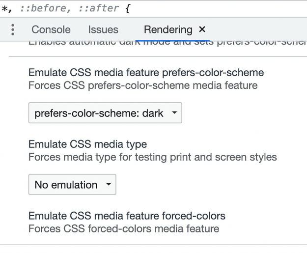
An easy way to test prefers-color-scheme is through Chrome's Rendering tools:

Codepen
See the Pen CSS variables and dark-mode by Pedro Marquez (@pfernandom) on CodePen.
Conclusion
CSS variables are extremely useful to standardize our stylesheets and make them configurable.
In this post we implemented dark-mode in a very simple web page, but the benefits of CSS variables and
the prefers-color-scheme media query are more apparent once we apply them in a real application with tons
of CSS rules.

